Thursday, August 16, 2012

John Paul Morabito

tonal warp stripe, 2010, linen, ramie, weaving, burning, 96" x 27"  see artist's website, john paul morabito
 "Of late my work has concerned itself with the actions of hand weaving and systematic burning. The process of weaving cloth by hand and then repeatedly burning it is an act of creation juxtaposed with an act of destruction. This sacrifice of cloth woven by my own hands is not a violent act. It is rather a quiet meditation.   
tonal warp stripe, 2010
 The holes are not burned quickly with ravaging flames. Instead each hole is made individually and slowly to create a contemplation of each moment that has been burnt away."  John Paul Morabito
Plain weave with stripes, 2009, see artist's website
John Paul Morabito turns 30 years in 2012.  He is a MFA candidate (2013)  in fibre and material studies at the school of the art institute of Chicago. 
plain weave with stripes, detail 2009
The patterns of dots on the neutrally coloured hand woven grounds are intriguing. On some pieces they seem like a natural kind of dis-colouring, like mold or insect holes.   On other pieces, they are measured and precisely placed.  But however beautiful they are, these marks are definitely not decoration.  There is a depth in this work that hits you in the heart.   
 "Perhaps left over from when we first realized our mortality, we have built into us a yearning for all things impermanent. To be human is not only to create but also to destroy. Called Thanatos, the death drive draws us to the end. I find myself in some ways ruled by Thanatos.
There is a need to make and a need to destroy, neither can be ignored. "     John Paul Morabito
strip construction, 2010  silk, rayon, handwoven, burned 33 x 69.  image from fibrearts magazine spring 2011
 Psychologists tell us that it is all part of the creative process.  It is necessary that we destroy what we have created in order to re-create. This is natural.  Creation and destruction and re-creation.  It is how change happens

But this young man isn't going so far.  He creates in order to destroy and stops there.  He says: " Humanness lies in the failure. The work then becomes a quiescent space of penance and finally acceptance."

It is compelling to think about this.  My body thinks about it. 
burned textile, detail of strip construction, 2010
John Paul Morabito's  work has been part of two most recent fiber art internationals that are held in Pittsburgh every two years.  In one of the final fiberarts magazines (spring 2011) he was featured in the emerging artist showcase.
Warp Faced Plain Weave, 2009, cotton, linen paper, weaving, burning, 55" x 47"  from Fiberart international 2010 catalog
  
 Drawn by the simple beauty of the marks, I respond emotionally to the slow, determined method the artist used to create them, one by one.  It is then that the philosophical ideas inherent in those marks work their way into my head.   It's all about human mortality.  This work is calm acceptance of that undeniable fact.  
After Penelope 2011
In After Penelope, the artist deconstructs an industrially woven textile with the idea of reconstructing it.  This is a switch from his earlier burned pieces.  The destruction happens first, then the idea of re-creation.  Is the artist becoming more positive with his meditations?

No.  John Paul Morabito abandoned this project.  See more images on his website.

"I work in repetition. Finding inspiration in the devotional mindsets of religion and masochism I undertake monumental tasks often impossible to complete. Simple, seemingly useless actions are repeated to the point of absurdity and stopped only when the possibility of going on without end is suggested. The work is concerned with the impossibility of eternity."

Tuesday, March 13, 2012

Anna Torma's transverbal series

Transverbal 3, 2010, hand embroidery on three layers of silk, silk threads, 143 x 130 cm.

Anna Torma's densely embroidered wall pieces have been inspiring Canadian textile artists since she moved to Canada from Hungary in 1988. The Transverbal series highlighted in this post have recently returned from their showing at the Rijswijk Textile Biennial at the Museum Rijswijk in the Netherlands. Transverbal 4, 2010, hand embroidery on three layers of silk, silk theads, 144 x 132 cm. Detail.

These pieces seem different than the artist's previous embroideries which juxtaposed her own children's wild and wonderful drawings with traditional stitches and tumultuous colours and shapes. Those marvelous and menacing drawings appear in these pieces more like ghosts. Crowded and connected with lines and circles, they seem to be in the process of becoming something other, as if in transformation. Transverbal 2, 2010, hand embroidery on three layers of silk, silk threads, 130 x 132 cm.

Anna Torma's transverbal series uses line. Lines that cross big spaces, outlines of circles that join to each other and linear abstract imagery. It seems as if the artist has made large doodles - (the works all measure about 5 feet square). Dream-like, confident, masterful these pieces are more than ever on the threshold of inner/outer. They are liminal. Perhaps even sublime.

With this work, Anna Torma enters the magic realm of Paul Klee, Cy Twombly, or Jackson Pollock. The specifics of the drawings are not as important as the general feeling of energy we feel from the whole thing. There is a kind of distraction because the eye cannot settle that carries the viewer into their own world of memory and dream. Transverbal 1, 2010, hand embroidery on three layers of silk, silk threads. 142 x 128 cm.

The wonder that impresses the most in these artworks however, is not just that the swirling lines have been so beautifully and intuitively drawn in a transverbal manner, but that they were then stitched. One stitch at a time, in an out with the needle. In and out, like breathing. The artist used her hands and touched these pieces repetitively for hours and hours and hours. This careful and caring touch to commit a line to soft cloth makes these pieces very powerful. It's as if the line that came straight from her inner self was made true and real with slowness and intent. Transverbal 5, 2010, hand embroidery on three layers of silk, silk threads. 142 x 128 cm.

Anna Torma's embroideries are all over the internet. Googling her name will bring up many blogs and galleries that highlight her work. Here and here and here are just three of those. Her own website may be the best place to start.
All of these images are from the Rijswijk Textile Biennial 2011 catalog published by Museum Rijswijk.

Monday, February 13, 2012

Mark Rothko

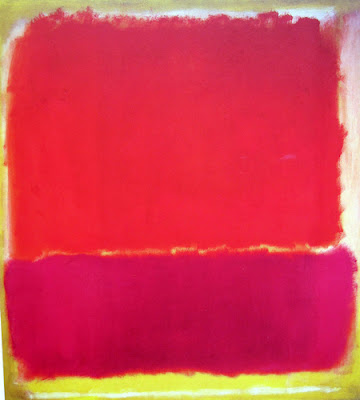
No. 12, 1951 57" x 52"

Mark Rothko's paintings from the 50's are probably the most obvious artwork to feature in this blog about the modernist aesthetic. Certainly, his work has inspired generations of artists and moved countless art lovers for seventy years. When we think of high modernism, his name is one of the first mentioned.

Around 1940, he took a year long break from painting to continue his intensive self study of philosophy and myth. His paintings at the time were figurative, but his writing of that time shows that he was honing his personal understanding of the colour field work in which he would eventually reign supreme. 
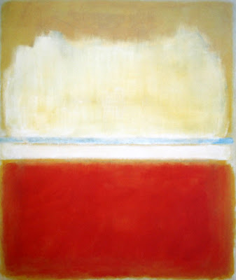
No. 8, 1952 81" x 68"

He wrote a book which remained in manuscript form for over thirty years. It was never really edited by Rothko himself, but he held onto it through a divorce and second marriage, two children, house moves, and his own phenomenal success, probably thinking that someday he would have enough time to do so. His son, Christopher Rothko, has edited his father's manuscript and writes a lengthy introduction about the difficulties of doing so.
Christopher's respect for his father's legacy is evident. "Rothko had no patience for anything that did not aspire to the highest ideals." 
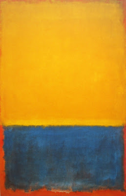
Yellow and Blue, 1955, 102" x 67"

In the book, it is amazing to read that Mark Rothko was searching at that time for a way to introduce the tactile sense into his painting. He feels this can be done with the use of light.
And, he wanted to have emotion in his work, identifying the tragic emotions like fear and anger as being the most important, (although artists working today have added a more positive emotion, wonder, to that list). As well, Rothko wanted to mix the subjective with the objective and come to a kind of universality.

These are the ideas of phenomenology, but Rothko never refers to Merleau Ponty, or Gaston Bachelard in his writing. He probably was not aware of them although they were working at the same time. (Merleau Ponty's Phenomenology of Perception was published in 1945, Bachelard's Poetics of Space in 1958.) For me, this makes me understand why Rothko's work has never lost its ability to move viewers to tears. He is able to connect to the immensity within (Bachelard's term) through the body's tactile senses, strong emotion, and a kind of universal intimacy.

It is tough going to find this essence of Rothko in his writing however, because his ideas are often buried in a pile of repetitive complaints. While I am glad that Christopher Rothko did not remove any of his father's words, it would be a service to the art world if someone was able to summarize the great man's book into a simply understood essay. 
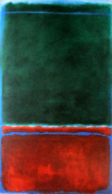
No. 7, 1953 91" x 55"

When Rothko was painting his most famous pieces during the 50's and 60's, he did not say very much, although he was often interviewed. His words from that time have been oft-quoted but they are so mysterious. This book makes those ideas clear.

It's as if Rothko had internalized his ideas so much, he didn't feel it was necessary to spell them out for those of us who were so eager. 
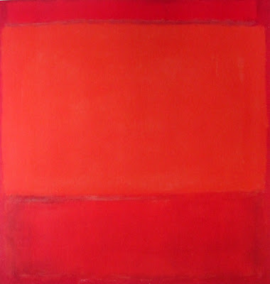
Orange and Red on Red, 1957 69" x 67"

Rothko quotes or summaries from the book:

"The painter must be likened to the philosopher rather than to the scientist. Philosophers are verbal., they use numerical logic to sort out ethics. But the artist is more concerned with human sensuality." page 22
"Our eyes, our ears, all of our senses, are simply the indications of the existence of a veritable reality that will ultimately resolve itself to our sense of touch." page 25
In the Renaissance, there were three breakthroughs for the visual artist. Linear perspective, oil paints, and chiaroscuro. But sensuality could not be expressed with these. Light was necessary, to produce the quality of emotion. page 35 
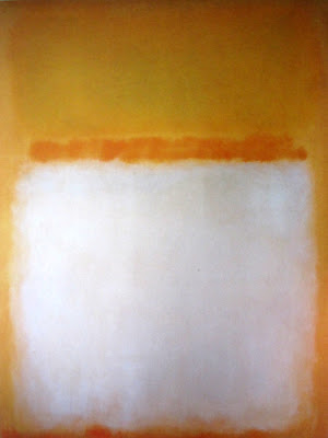
Untitled, 1955 92" x 69"
While writing this book, Rothko was reading Nietzsche who believed that the entire function of art is to produce a way to endure man's insecurity. He was also reading about primitive art, and came to his own conclusion that it was closer to the emotional.
Rothko felt that the Renaissance and all that came after it, was more about the "outer reality" of perspective, light and shadow, while in Gothic times, Egypt, or Africa, art had been more about our 'inner reality'. Rothko wanted to go back to that timeless period, and terms it the artist's reality. 
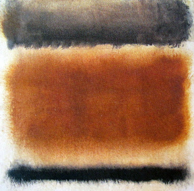
Untitled, 1958 16" x 17"

All of these images are from the 2001 Beyeler gallery monograph of Mark Rothko. The text was inspired by The Artist's Reality: Philosphies of Art by Mark Rothko, edited by Christopher Rothko and published in 2004. There is a lot of information about Mark Rothko on the web. Here and here are good starts. Christopher Rothko talks about the book in this video.