 |
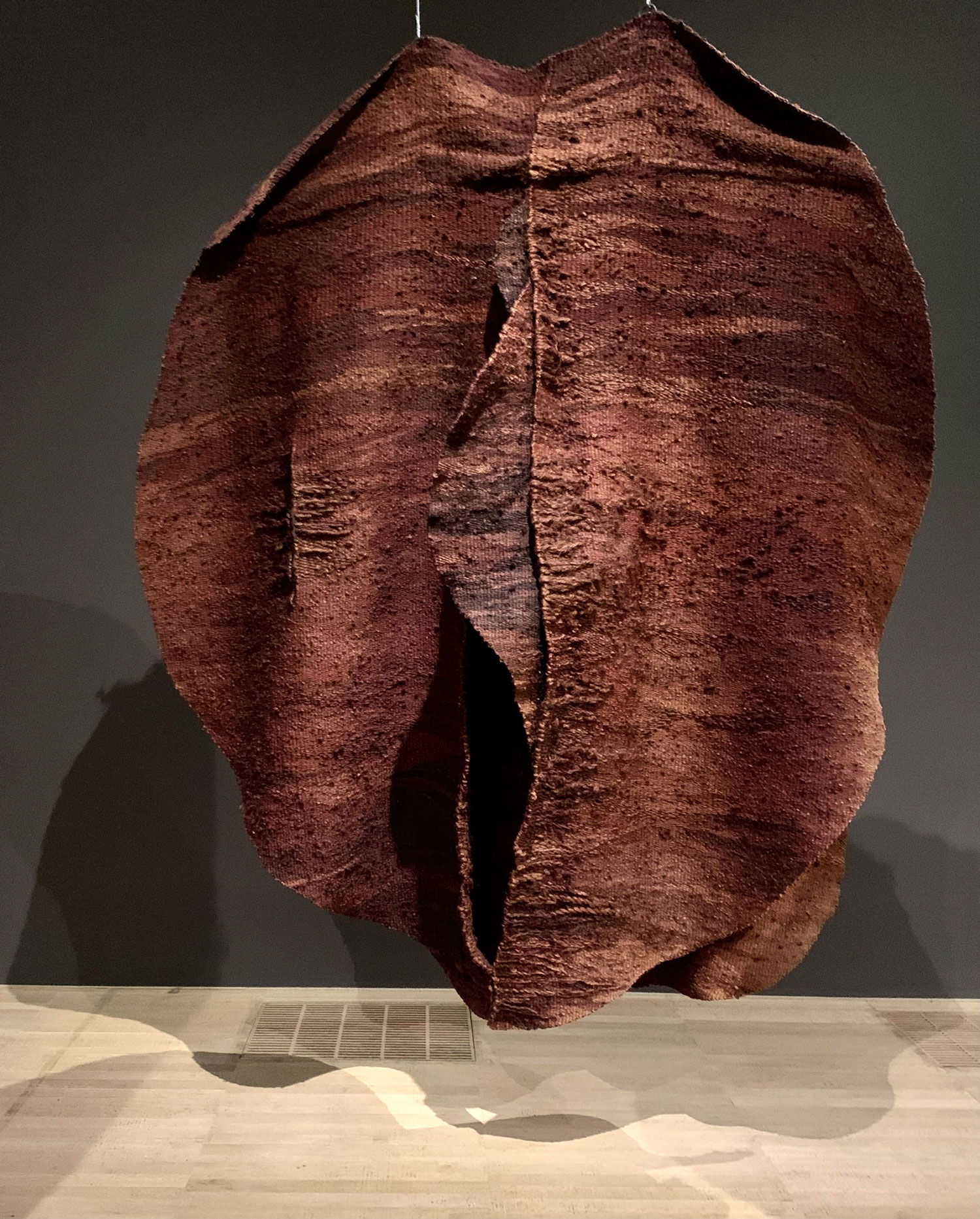
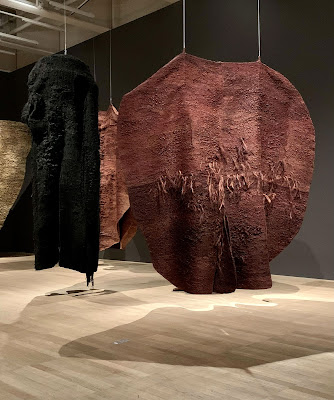
Black Ball 1975, Sisal, 140 x 110 x 100 cm
and Abakan Red 1969, Sisal 405 x 382 x 400 cm
|
Polish artist, Magdalena Abakanowicz (1930-2017), created and displayed monumental woven textile sculptures in site specific environments so that people could move around in as if in a forest of large cloaked figures.
The sculptures were named Abakans, after the artist's own name.
Created in the late 1960's and early 70's, they remain hugely influential. They show how soft objects can have great expressive power. When we move through them, there is a feeling of breath and touch, of fertility and decay, of connection between humanity and all living things, animal or plant.
 |
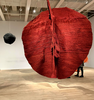
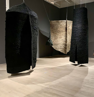
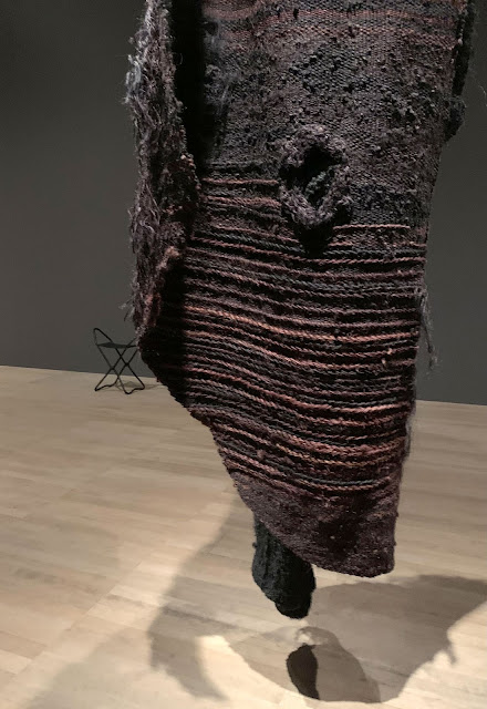
in foreground Abakan Festival 1972 Sisal 370 x 100 x 100
and Abakan Brown IV 1969-84 Sisal 290 x 300 x 30 cm |
I see fiber as the basic element constructing the organic world on our planet, as the greatest mystery of our environment. It is from fiber that all the living organisms are built, the tissue of plants, leaves and ourselves.
Our nerves, our genetic code, the canals of our veins, our muscles.
We are fibrous structures. Our heart is surrounded by the coronary plexus, the plexus of most vital threads.
 |
Black Garment VI 1976 Sisal 330 x 220 x 100, Abakan vert 1967-68 sisal 260 x 60 x 30,
Winter 1975 - 80, sisal 320 x 360, and Abakan Festival 1971 370 x 100 x 100 |
Handling fiber we handle mystery.
What is fabric? We weave it, sew it. We shape it into forms.
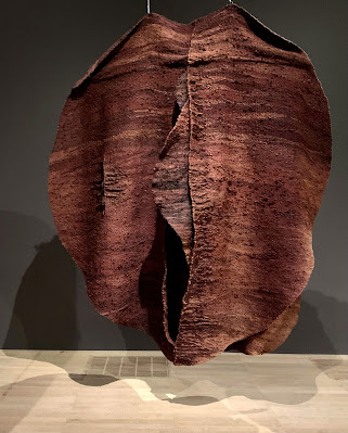 |
| Abakan Brown 1969 Sisal 300 x 300 x 150 cm |
When the biology of our body breaks down, the skin has to be cut so as to give access to the inside.
Later it has to be sewn, like fabric.
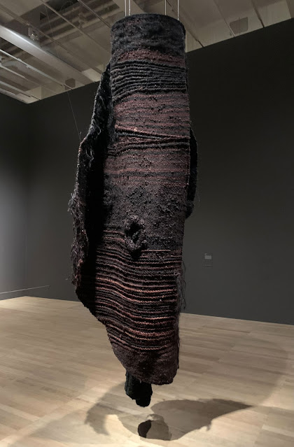 |
| Abakan etroit 1967-68 sisal and wool 320 x 100 x 100 cm |
Fabric is our covering and our attire.
Made with our hands, it is a record of our souls.
 |
| sisal and wool abakan |
My works are organic like creations of nature.
And like creations of nature, they will eventually turn into earth.
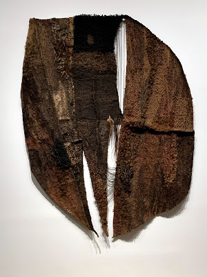 |
| Assemblage noir 1966 sisal, wool, hemp and horsehair 300 x 220 |
They are born from the effort of my fingers, wrists and muscles.
Only in this way can I pass on to them my energy and my secrets.
Only in this way can I learn their secrets.
 |
| Brown Coat 1968 sisal 300 x 180 x 60 cm |
The threads I weave make up homogeneous fabric, the expression of which depends on the tension or the relaxation of my nerves.
 |
| Abakan - Situation Variable II 1971 sisal and rope 400 x 250 x 100 |
Forms result from everyday emotions, like a diary.
They are a product and the record of my time, with its experiences, disappointments, longings and fears.
 |
| sisal and rope 1971 detail |
My forms change as time goes by like my face.
 |
| Abakan Yellow 1970 sisal and rope 380 x 380 x 70 |
My Abakans are a protest against the weaving conventions.
A need to guide people into a world different from that of a noisy street and a brutal technique.
They are a cry of despair in the face of the ailments of civilization.
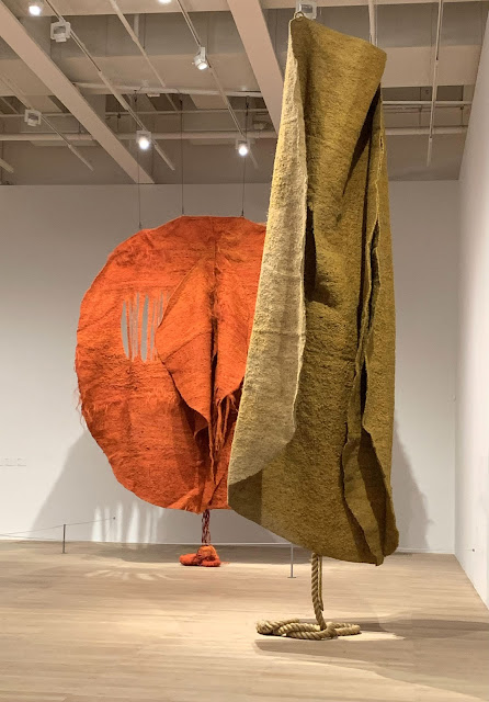 |
| Abakan Orange 1968 sisal 360 x 360 cm and Abakan Yellow 1970 sisal and rope 380 x 380 x 70 cm |
They are, like sweat, a symptom of my existence.
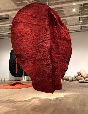 |
| background, abakan orange on floor, abakan january february 1972 behind it, and some of the 800 embryology bundles. Foreground is Abakan Red 1969 Sisal 405 x 382 x 400 cm |
The text in italics is from Magdalena Abakanowicz's presentation at Fiberworks: Symposium on Contemporary Textile Art in Oakland California, May 1978. The images are from the exhibition Every Tangle of Thread and Rope, curated by Ann Coxon, the Tate Modern, London, England for winter/spring 2022-23. An excellent video produced by the Tate: click here!